Content Design: How do you build building blocks?
Enabling users to create donuts out of dough.

I still remember my first building blocks toy as a kid — blocks of colorful plastic that fit into each other (it was kid-friendly Lego that came in a large yellow bucket) — I spent ever so many hours assembling, breaking apart, and joining again, trying to create something that felt exciting to my two-year-old self .
We all love to create. But what if the task was creating not the finished outcome, but the very blocks that allow us to create it? What design principles would apply to such a task, that the building blocks would be easy to use, fun to create with, and could be assembled together to create something truly meaningful?
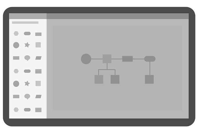
While working as a designer on Microsoft’s diagramming web-app, I got a chance to produce just these — the very shapes, with which diagrams are made.
I worked on art direction and laying down content guidelines. I got to be a part of content production in a very ground-up manner —how content fit into the overall app architecture, the production process, and design principles needed to ensure that the shapes would easy to use and delightful.

The Building Blocks
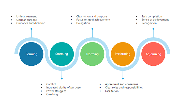
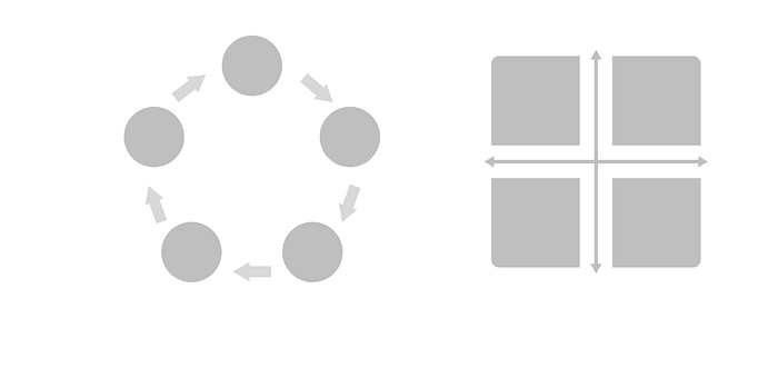
Content in the diagramming webapp is structured in this manner: shapes form shape-sets, and one or more shape-sets form a template. Templates are associated with a particular diagram-type: eg: Flowchart, Process Diagram, Cycle diagram, etc.
Why Content?
Content design is certainly not very glamorous. But done right, it can be hugely impactful. Here’s why I think content design is worthwhile:

| Content is power
Great content allows users to unleash their creativity in unforeseen ways. Truly great content is not something groundbreaking in itself — It forms the building blocks for something that could end up being used in an innovative manner! In a diagramming context, a good set of shapes gives users the power to express their intent. One shape-set, many possible outcomes.
| Content creates meaning
Good shape sets allow users to explain complex concepts, and create meaning. Arrows for direction, text blocks for explanation, and the right shapes- all come together to break down and convey larger ideas.
| Content contributes to user experience
In a digital context, shapes are interactive and have specific behaviors associated to them. They can be designed to behave in a particular way on resizing, flipping, and other operations. They can have control points for various axes, can have built-in smartness and can replicate, scale, or snap in a certain way. Given this complexity, shapes play a major role in contributing to the user experience of the diagramming application.

| Content is beauty
This graphic was entirely created using the Basic Shapes set of the diagramming app. The shapes were intended for professional diagrams—but this goes to show that shapes provide a certain aesthetic appeal which is one of the motives of why people create diagrams — to catch the eye! Beautiful content can make a diagramming app delightful to use.
| Content is a differentiator
In a crowd of diagramming web-apps that are available for free, innovative and attractive content acts as a differentiator — and could be a major reason for people to adopt one app over another.
Design Principles for Content Design
1. Designed for the user
Just like any other user experience project, content design needs to be domain specific and user-focused. The type of shapes that college students would need to create poster vs electricians for circuit diagrams — would be very different. The shapes must be relevant and meaningful to the user.
Our user was the information worker creating basic diagrams for professional use. Basic diagrams comprised the larger umbrella of flowcharts, block diagrams, process flows, and schematic diagrams. These diagrams would then live in the user’s documents and presentations. Understanding this user flow and the endpoints was critical — and influenced the shape sets needed, shapes within each set, aesthetic, and guidelines to create shapes.
It also required a deep understanding of basic diagrams, in the larger context of visualizations — how they are different from, say Infographics, data-visualizations, and other more domain-specific diagrams.
2. Scalable
Shapes must be versatile in form— they must have the ability to scale to different use-cases.
On a different note, shapes must be interactive and adaptable. They must be programmed to scale a certain way when resized, ‘anticipate’ shape-text smartly, expand in the ‘right’ direction, and must provide for a smooth user experience.
eg: When a numbered- block like this is resized lengthwise, only the rectangular element needs to extend. Height-wise, both the circle and the rectangle need to scale up proportionally.

3. Aesthetic
Shapes should assemble into visually appealing, professional diagrams. They should be well crafted. Since content refreshes for the app are expensive, the style guide should reflect a timeless aesthetic that is not too heavily- influenced by visual trends.

4. Lightweight
Shapes should be composed of as few sub-shapes as possible. They should be lightweight and lean. This ensures better app performance and enables larger diagrams to be built with ease.

5. Pre- assembled
Wherever possible, pre-assemble. This makes diagram creation a quick and easy process. We ensured that all common use-cases were covered, and provided ready-made starter-diagrams for users to start from.
Learning from the Content-design experience
Laying down guidelines and managing the content-design project was an initiative unlike any other - It involved closely working with design and dev vendors. Shape visual blended seamlessly with shape-behavior, and we closely followed the process that was laid down, as each shape was crafted with loving care.
Each shape-set was approached on a case-by-case basis, and compete study was done, moodboards were created, and style-guides were set. Some shape-sets like UML diagrams, Network Architecture Diagrams, etc involved domain-knowledge and technical understanding. Weeks of testing and bug-bashing later, we had an attractive, robust and well-functioning shape-set!
To read-on about how these shapes were surfaced to the users, using a shapes-panel, read my other article: The Spice Rack Quandry. Write to me for questions, and if you have something to say, leave a comment below!
